
TYPEBURG is a comprehensive online resource for typography, where Professor Jorge Montero shares his expertise and passion for the art of typography. You'll find examples of his work, in-depth insights, tutorials, and resources on letterform design, history, and essays on typographic communication, and the world of type.

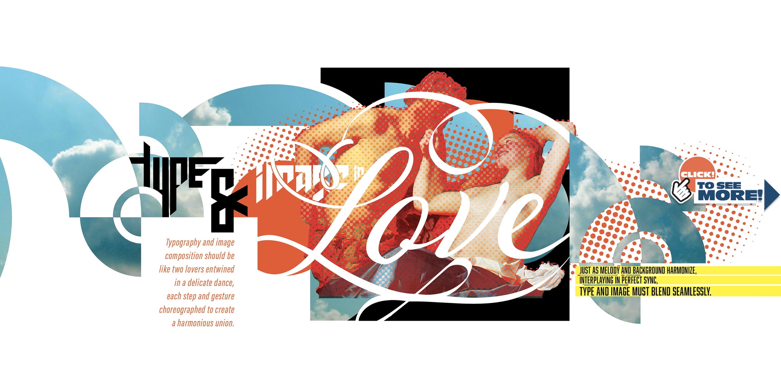
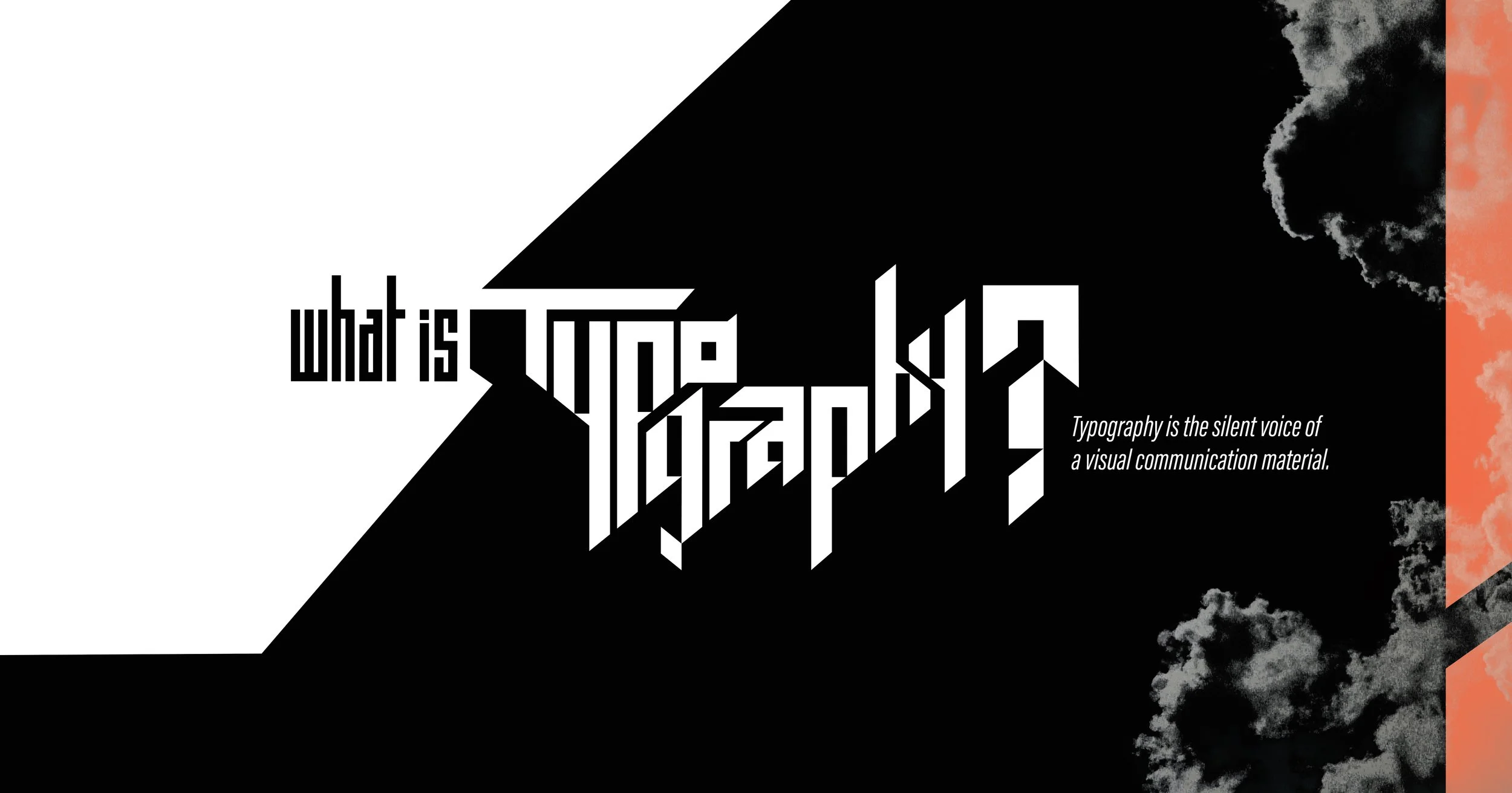
The key of how to work with typography?
Apply the same logic or reasoning that we use when we talk.
Professor Jorge Montero
Typography's strongest fortress,
to share our passion!
r .
Defend the fonts,
conquer the page.


Professors Ursula Bertram and Dr. Dr. Ing. Werner Preissing with the Book in Mainz, Germany

THIS PAGE
belongs to the book “Typographic Structure”
by Jorge Montero


Type design, art and photography:
Jorge Montero
THIS PAGE
belongs to the book “Typographic Structure”
by Jorge Montero

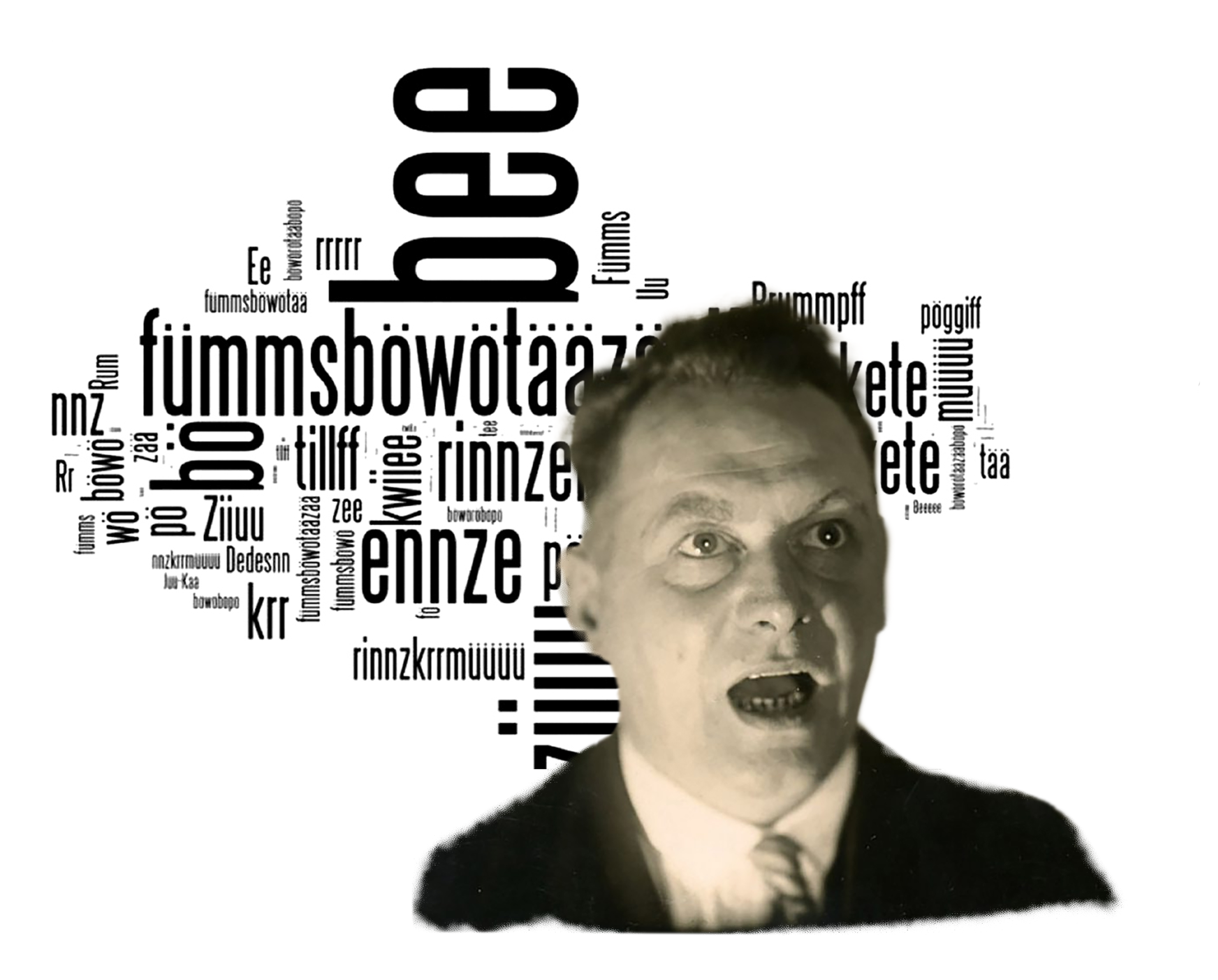


Kurt Schwitters was a true pioneer of avant-garde typography, pushing the boundaries of language and visual expression. His work on the "Ursonate" sound poem is a testament to his innovative spirit, but his typographic experiments went far beyond. Schwitters' "Merz" publications, a series of periodicals he founded and edited, showcased his bold and inventive use of typography, featuring eclectic layouts, fragmented texts, and unconventional fonts that blurred the lines between art and literature. His typographic work was characterized by a sense of playfulness, experimentation, and rebellion, influencing generations of artists, designers, and writers. By combining typography, collage, and sound, Schwitters expanded the possibilities of language and art, leaving a lasting legacy in the world of avant-garde art and design.


Every moment offers a new chance to create something innovative and unique. Don't lose that opportunity repeating the past; instead, infuse each day with vibrant colors of courage, creativity, and purpose.
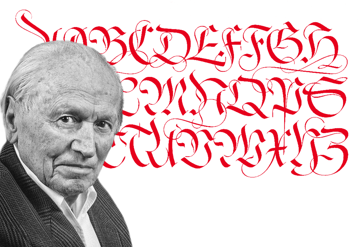
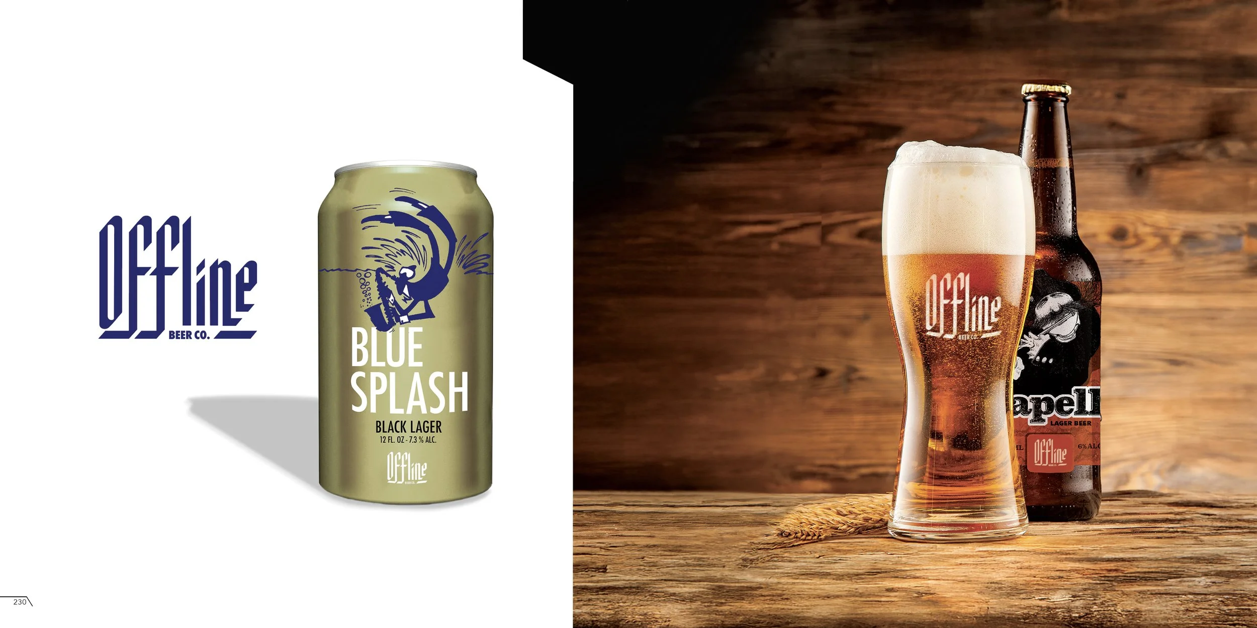
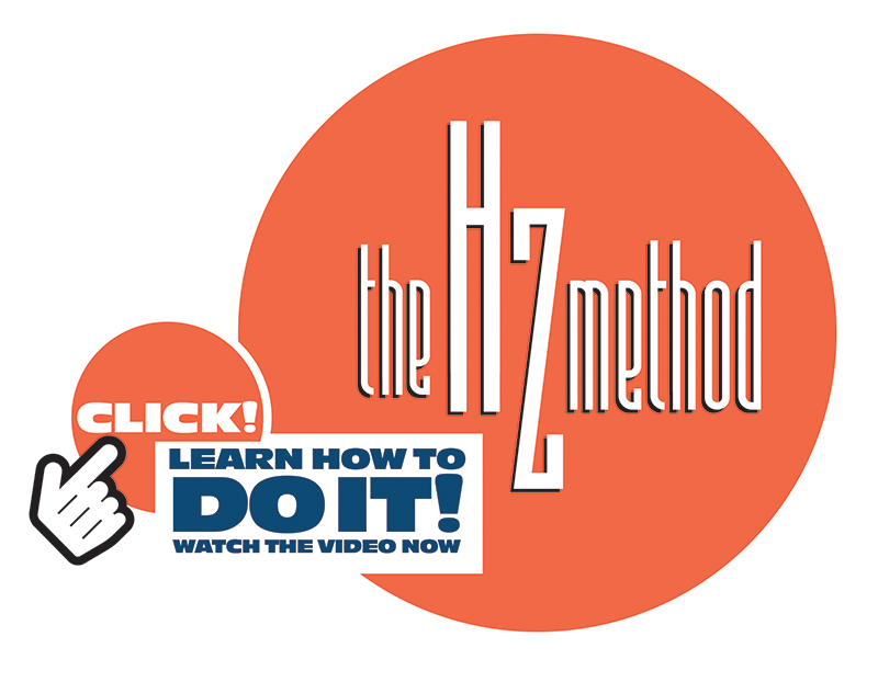
Hermann Zapf (1918-2015) was a German typographic mastermind whose elegant and versatile typefaces continue to shape the visual landscape of our world. With a career spanning over seven decades, Zapf left an indelible mark on the world of typography, creating iconic fonts like Palatino, Optima, and Zapfino that are still widely used today. His work was characterized by a unique blend of traditional craftsmanship and innovative design, reflecting his passion for calligraphy, typography, and the art of beautiful writing.
In the late 1980s and early 1990s, Zapf developed his ideas for the proprietary Hz-program (often referred to as the Hz-system), an innovative method for avoiding "rivers" of white space that can appear in justified text, specifically designed for digital typesetting. The program was developed in collaboration with the German font technology company URW and programmer Peter Karow. The Hz-program involved adjusting word and letter spacing, and character scaling, to create a more uniform and aesthetically pleasing text flow. This patented technology, which Zapf refined over the years, was later acquired by Adobe Systems and incorporated into their InDesign software, remaining a valuable tool for designers and typographers.
As a prolific writer, educator, and designer, Zapf's influence extends far beyond his own creations, inspiring generations of designers, typographers, and artists to push the boundaries of visual communication. His legacy is a testament to the power of typography to shape our cultural heritage and everyday lives.
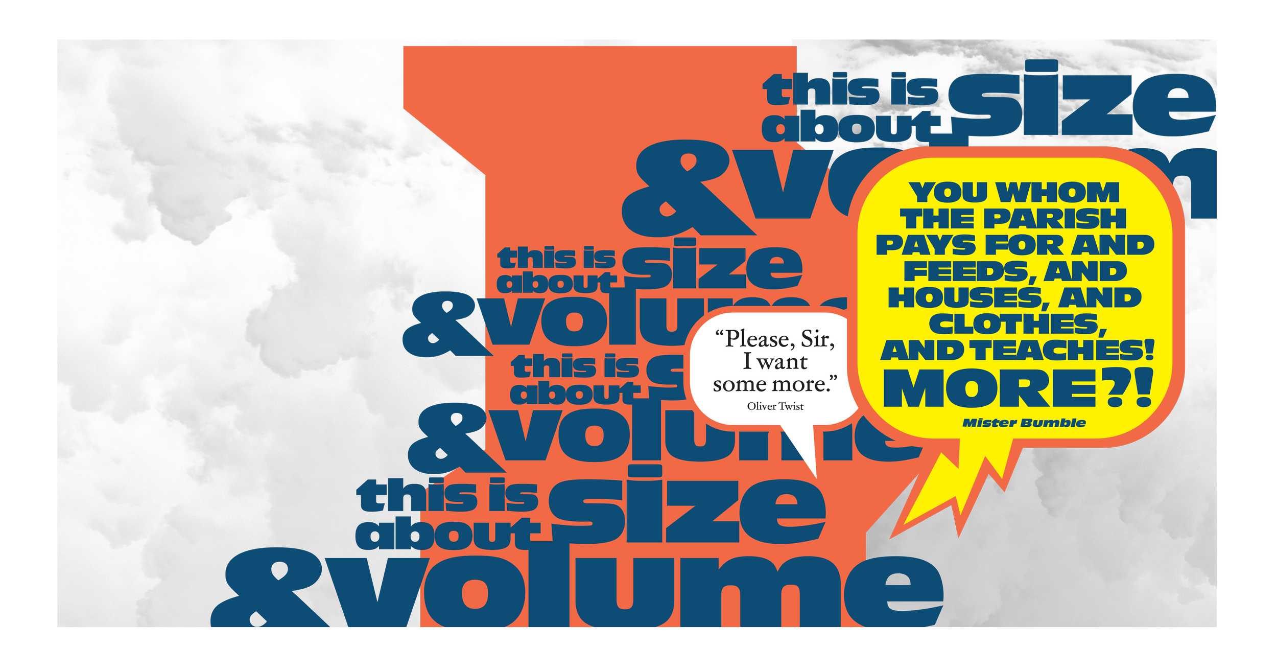
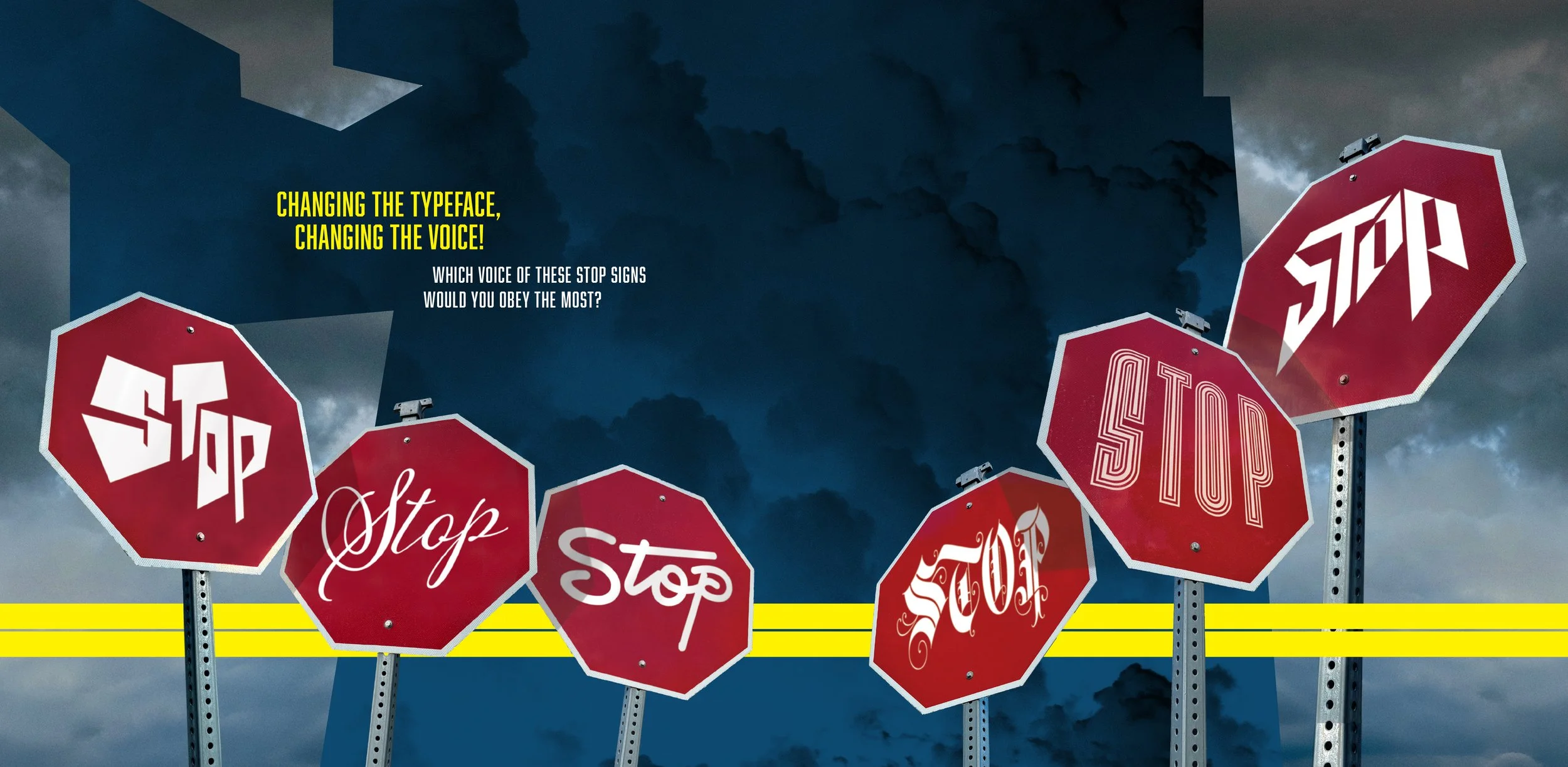
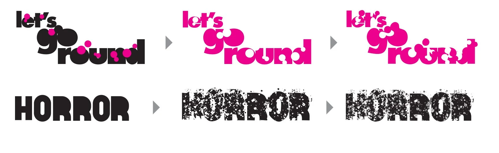
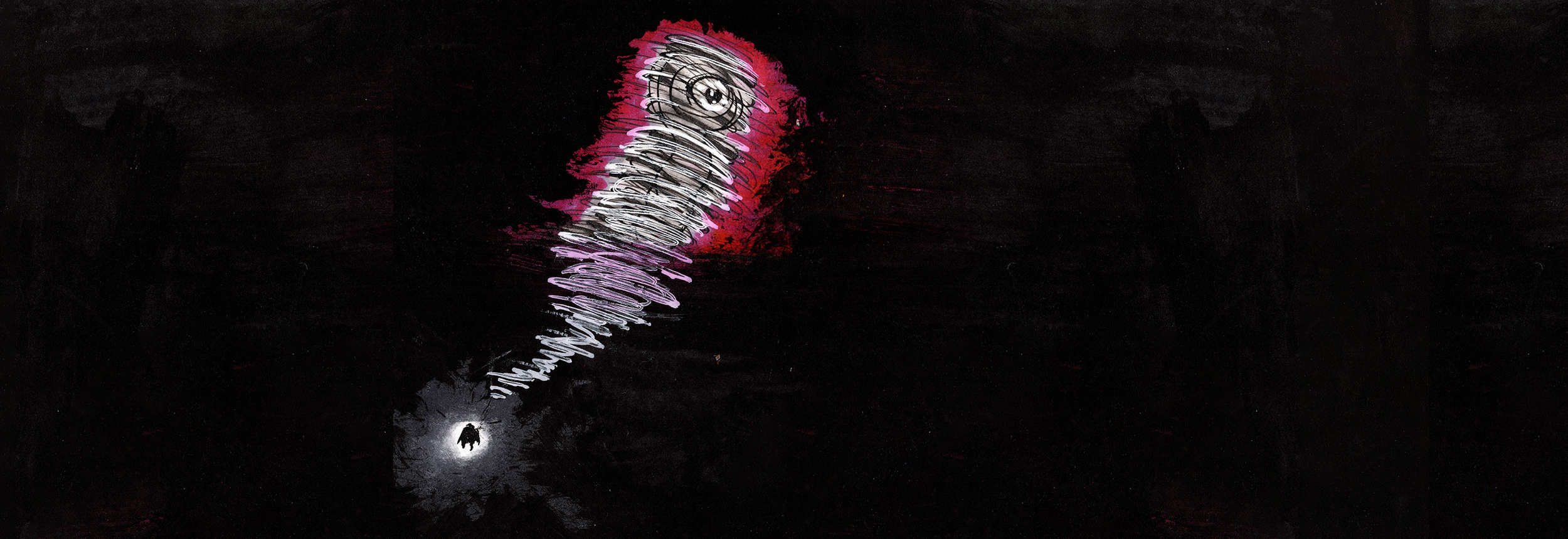
THE VOLUME OF A VOICE
equals the size of type
You know how we naturally flow when we're chatting? We can bring that same logic to typography by using design elements that mimic the essence of conversation. It's all about making the text feel like a voice, not just dull words on a surface.
For example:
THIS PAGE
belongs to the book “Typographic Structure”
by Jorge Montero

NEVER EVER DISTORT
THE SACRED PROPORTION OF A TYPE


THIS PAGE
belongs to the book “Typographic Structure”
by Jorge Montero

The Maverick Typographer
Who Redefined Visual Communication
A true luminary in the world of graphic design, Herb Lubalin was a monumental influence on the industry of visual communication, particularly in typography. As one of the most consequential graphic designers of all time, he left an indelible mark on the field. Serving as the archetype of the modern type director, Lubalin's mastery of typographic structures was unmatched, and his influence remains visible in designs today. His work was characterized by an elegant sophistication, yet he was never afraid to take risks—he was a daring innovator, consistently pushing the boundaries of what type could achieve.
Lubalin's legendary collaboration with Ralph Ginzburg, the founder of Eros and Avant Garde magazines, perfectly showcased his groundbreaking approach to typography. This partnership produced iconic typefaces such as Avant Garde, a geometric sans-serif font that became synonymous with the aesthetic of the 1960s and 1970s, and Lubalin Graph, a bold, geometric slab-serif font. Avant Garde was especially notable for its inventive use of ligatures and diverse glyph designs, which injected the font with both elegance and creative whimsy. Lubalin's deep commitment to typographic experimentation was evident in the typeface's many alternate characters and revolutionary uses of tight kerning and precise leading.
Through his editorial work, particularly with U&lc (Upper & lower case), an influential international journal of type and graphic design that he co-founded in 1973, Lubalin's designs became the definitive benchmark for modern typography. He served as the journal's founding designer and editorial art director until his death in 1981, transforming U&lc into the premier platform for experimental and expressive typography. His distinctive use of bold typography, innovative layouts, and provocative imagery challenged the conventions of print design. Lubalin’s genius lay in his singular ability to distill complex concepts into simple, yet powerful, visual statements. His body of work demonstrated the profound ability of typography to communicate, persuade, and inspire.
A true original, Herb Lubalin’s legacy continues to fuel designers, serving as a powerful reminder that great design demands creativity, courage, and a willingness to break the established rules. Through his work, Lubalin proved that typography is not merely about arranging words, but about crafting an experience. His designs continue to influence and inspire new generations of creative professionals, cementing his place as one of the greatest typographers in history.